
Desmos Graphing Calculator is an online tool, free to use, used to display math graphically. Everything in Desmos is made up of pure equations. It is from these equations that, over the last few years, I’ve built some pretty neat things, which I’ve kept here. Click on any of the titles or images to take you to the graph!
Jump to: Static • Animated • Interactive
Static
Freedom
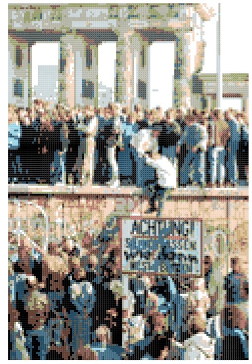
This image was taken in November 1989, at the fall of the Berlin Wall, a symbol of hope amid the East-West division that had dominated geopolitics for much of the 20th century. I adapted this image using mean shift clustering (more on that later!) to recreate it in Desmos.
The Blue Marble
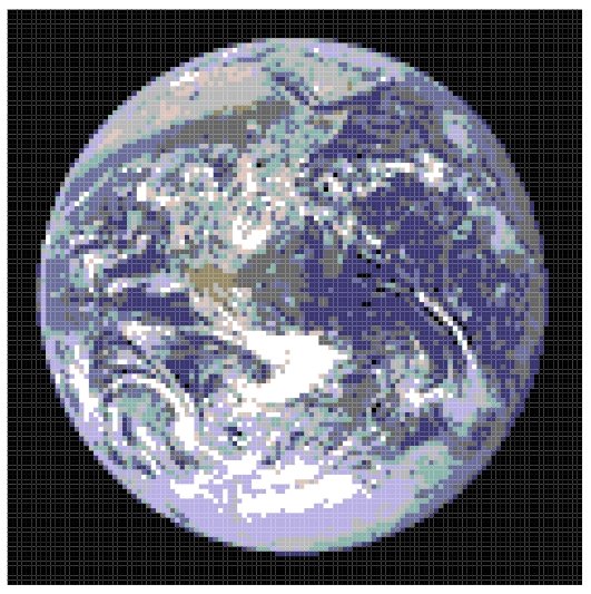
Another famous photograph of the 20th century, this one taken by the crew of Apollo 17 in December 1972. It is perhaps the most famous image of the entire Earth ever taken, as it represents such an enormous milestone in our technological development. Much like the Berlin Wall photo, I used mean shift clustering to adapt this image to Desmos.
My Cats
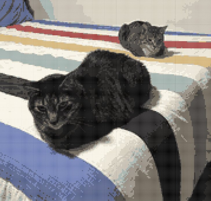
Unlike the other images, I took this one myself, of my two cats, sitting on my bed. This image, being larger, was a considerably more ambitious project than the above two, but thanks to my mean-shift clustering algorithm it was fairly straightforward putting this together. (My cats’ names are Jojo and Schrödinger! Jojo’s the one in front.)
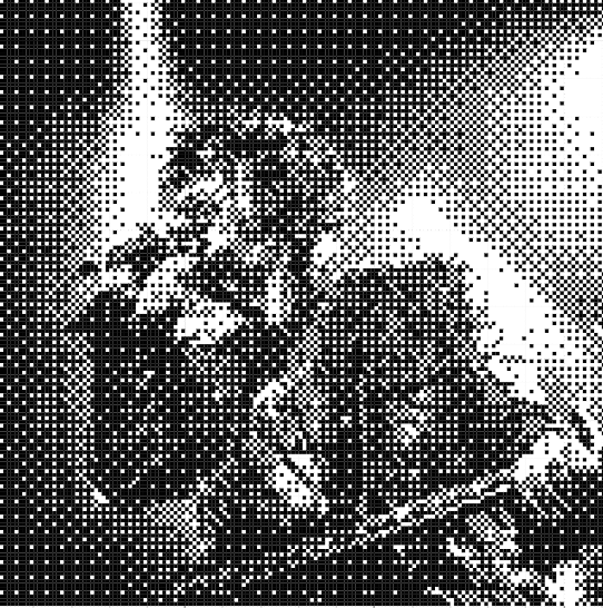
Rocker Dithering
To convert a grayscale image to a genuine black-and-white one (that is, an image that only uses black and white pixels), a process called dithering can be used, introducing some randomness to make the image clearer. This Desmos graph shows the original, full grayscale rockstar image; this one shows another style of dithering that’s less clear, but in my opinion looks just as cool.
To learn more about dithering, check out this amazing animated guide at visualrambling.space!
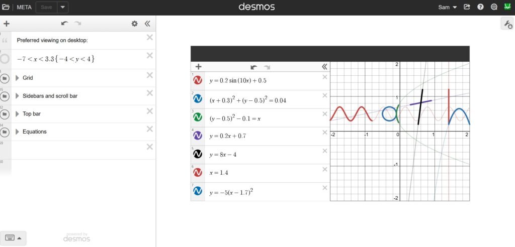
Desmos in Desmos
This is really a love letter to Desmos. It’s remarkable how a graphing calculator can have enough complexity that I could make a snapshot of that very same graphing calculator inside itself.
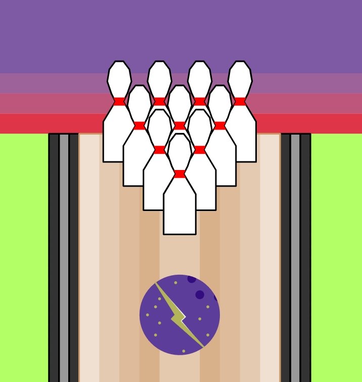
Bowl
One day, during what was supposed to be a PE class, we weren’t able to use the school gym, and instead were given an hour and a half of, essentially, free time. Bored, I decided to make this illustration, and it’s still one of my favorites, even if it’s pretty technically straightforward.
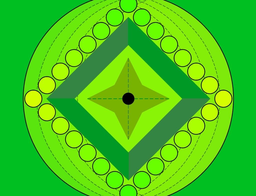
Emerald Emblem
Nearly two and a half years after I first designed this, it’s still the lock screen on my phone and the wallpaper on my laptop. There’s a lot to be said for the power of a monochromatic color scheme, especially when you combine it with such a variety of shapes all at once.
Animated
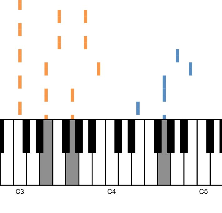
Music Box Lennon
This graph combines three of my interests – Desmos, the music of John Lennon, and my lifelong hobby of playing the piano. I to0k one of Lennon’s best-known songs, “Imagine,” and built a short loop reminiscent of a music box to play the first verse.
Bubble Sort
In AP Computer Science Principles, we learned about the efficiency of various sorting algorithms. While it was far from the most efficient, bubble sort seemed like it could actually be implemented in Desmos, and I created this visualization so you could actually see it in action.
Bad Apple!!
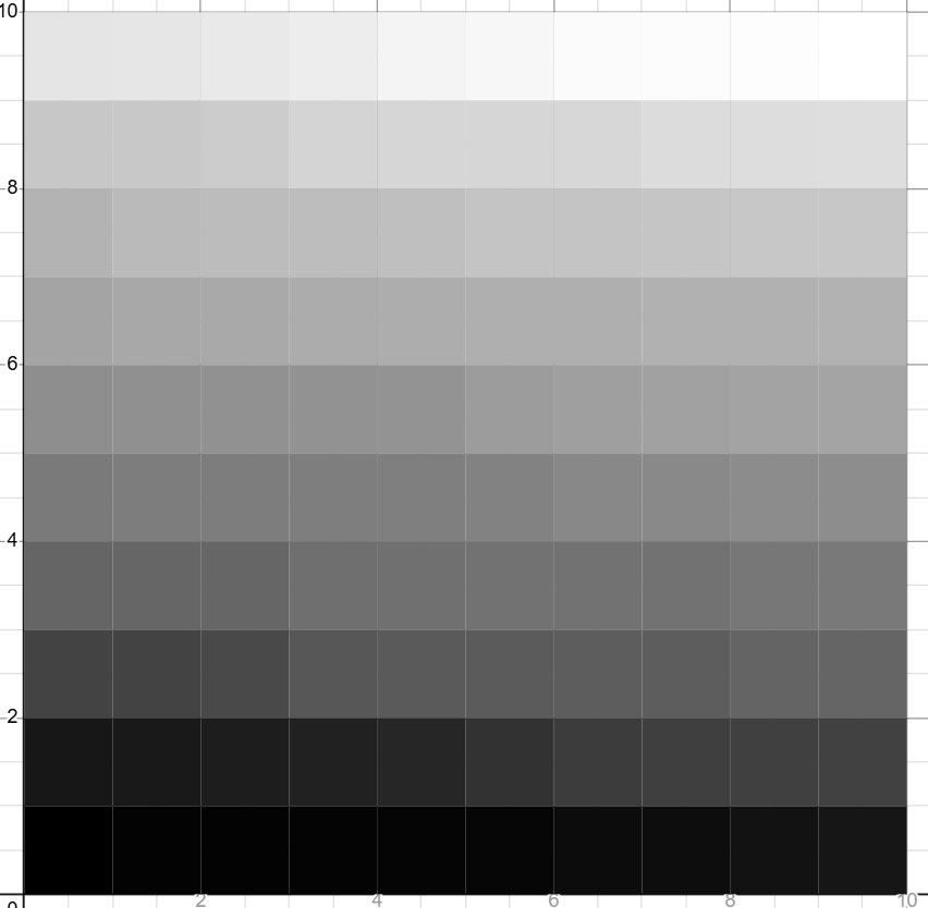
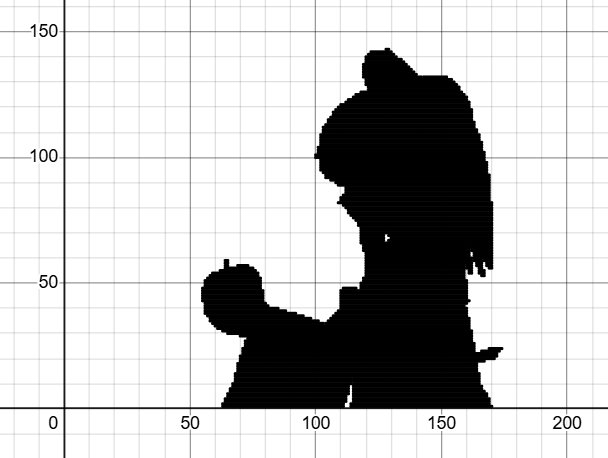
This project was inspired by one of the most famous music videos of the internet era: Bad Apple!!, which has been adapted to countless platforms. I spent several weeks working on this one, which is certainly the most technically difficult project I’ve ever finished, but I think the finished video looks amazing, so long as it can run on your computer. (I wouldn’t try opening it on your phone.)
Mean Shift Clustering
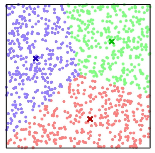
This demo shows a mathematical process that’s crucial in everything from grouping books by genre to making my pictures of the Berlin Wall and the Blue Marble above, known as mean-shift clustering. I initially learned about the concept from a Minecraft YouTube video and thought it was so interesting that I built this simulation to show how mean-shift clustering can be used to sort points into similar-sized groups based on their positions.
Normal Distributions
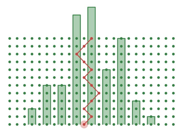
When I visited the Henry Ford Museum in Michigan, one particular exhibit on math, part of an old World’s Fair exhibition, stood out to me: an enormous simulation like this one, where beans would fall, hitting pegs, and landing disproportionately often in the center, eventually forming a bell curve as more and more reached the bottom. I’ve replicated that simulation here!
World’s Ten Largest Cities, 0-2100
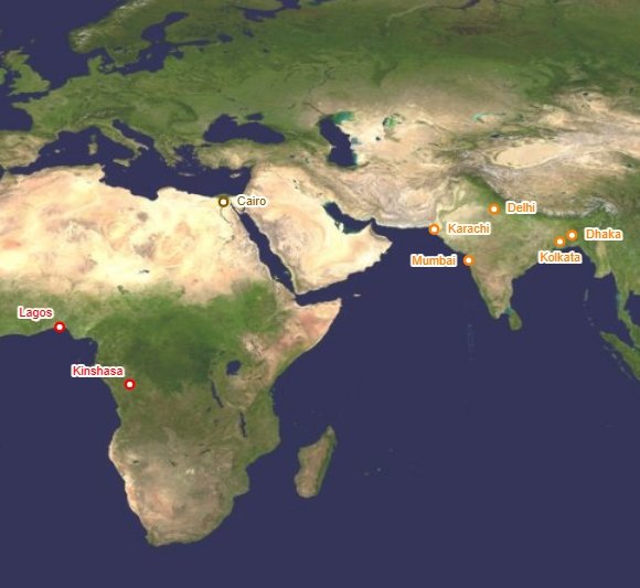
This was one of my first attempts at using Desmos for a more informational purpose. The animation shows the progression of the ten largest cities in the world, as they moved from ancient Rome and China to the medieval Middle East to classical Europe and modern East Asia, and then in the future to the Indian subcontinent and Africa. I had quite a lot of fun putting this one together!
Interactive
Sky Generator
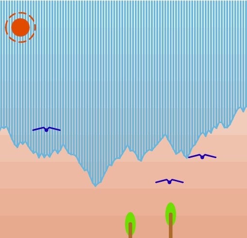
There’s something Zen about staring into the sky. Just for fun, I decided to replicate that experience in Desmos, complete with the sun, stars, clouds, birds, mountains, and trees, all entirely randomly generated by you.
Typing
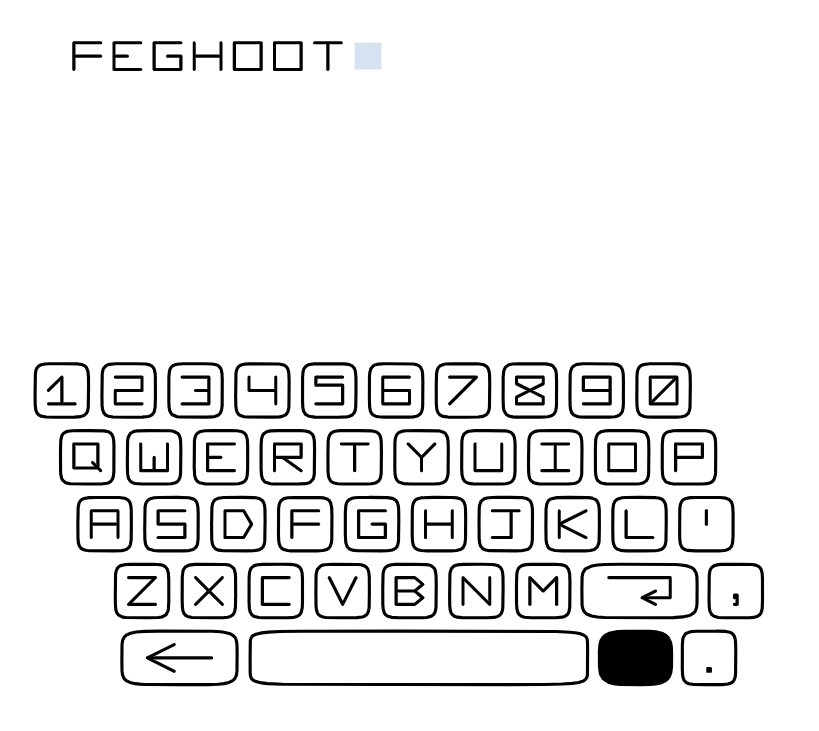
There is a pretty easy way to make words in Desmos (it involves labeling points). This is not that, but it does offer an alternative font! Easily the best part of this was actually getting to design the shapes of each letter to match a sort of old-school digital style.

Pixel Letters
In addition to designing yet another font for this one, my goal was to replicate the effect in many classic video games where text is typed out rapidly onscreen. While it isn’t the fastest, it certainly looks cooler than just manually typing out each letter, and it’s actually a much shorter program.
Conway’s Game of Life
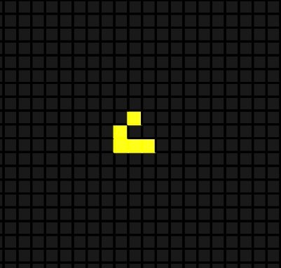
Conway’s Game of Life is a famous mathematical simulation designed by John Conway with surprisingly simple rules for the complex behavior it ends up demonstrating – much like my experience with Desmos Graphing Calculator. In this simulation, you can click tiles to try out your own starting configurations, and see what ends up happening!
Quacks of Quedlinburg
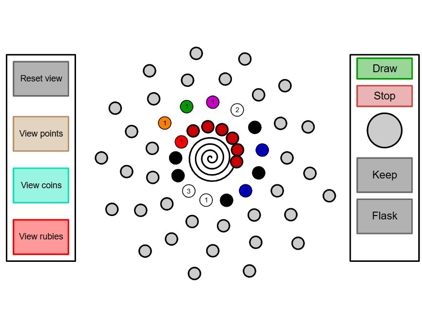
This is a direct adaptation of a real board game, sometimes also called Quacks, that I first played in middle school. Having taken a couple weeks during the summer, this is another one of my more technically challenging projects, and possibly the one with the most variables, but it’s also really fun to play.
You can learn the rules here.
Color Vision
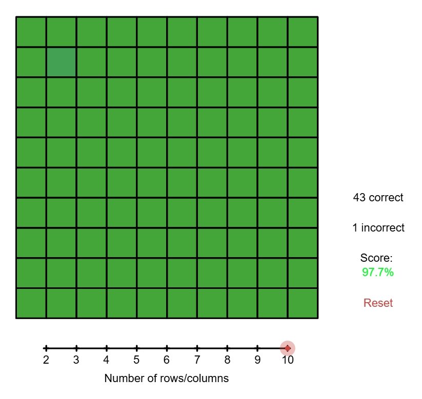
The goal of this game is to spot the one square that’s a slightly different color from the others. Sometimes it’s a lot easier than others, although if you think you’ve got really solid color vision, I recommend lowering the value of d to 20 or so and seeing how you fare then.
Snake
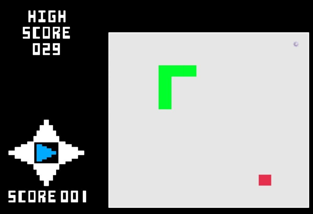
Based on the classic ’80s arcade game (which you may be more familiar with through its JavaScript or Google versions, depending on when you grew up), I designed this Snake version as my very first Desmos video game. You can customize the speed, board size, and color scheme as well.
Africa
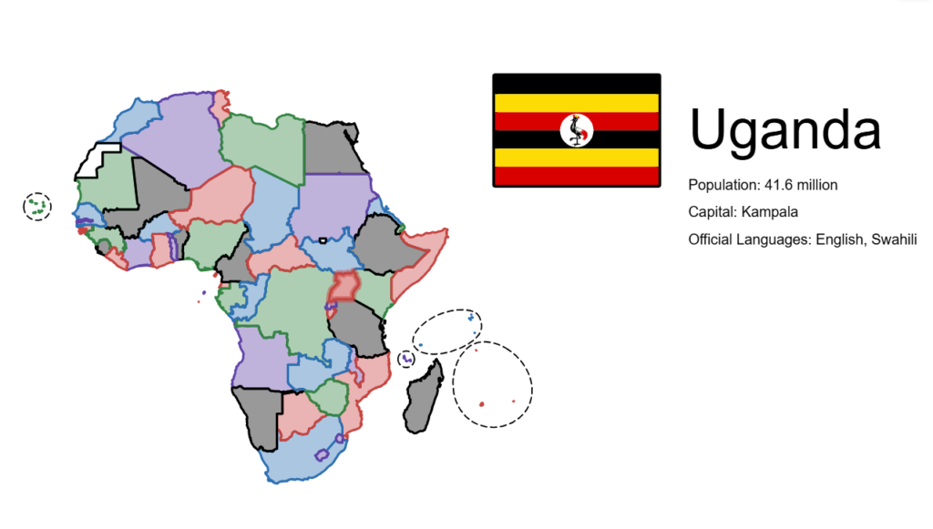
I consider this my magnum opus; it took more than a month of researching flags and sketching them to get the proportions and colors exactly right, but I love the finished project so much I submitted it to Desmos’s Graph Art Competition for 2025. Click on any country to see its flag, name, population, capital, and official languages!